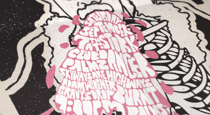
Here is a poster that I created a couple weeks ago for a show that I am helping out with in Oakland. This was a really great project to work on. It allowed me to showcase more of my illustrative side and gave me an opportunity to work in way that was more hand rendered. Although, don't be fooled. This poster was still done 100% digitally. Most of the composition was traced from pictures in illustrator. The type was done freehand in my sketchbook app. The sketchbook app is a great drawing app for the ipad. I use it a lot. The only downside to it is that it is essentially like drawing in photoshop. Which isn't bad per se, but if I want to work in vectors, I have to import the files into illustrator and trace it out from there. Which is okay, but you definitely get some discrepancies in the quality. For a project like this however, it doesn't really make a difference.
I'm not sure where I got the inspiration for this. I was sort of as looking at those old Dubonnet Liquor advertisements and wanted to somehow capture that look and feel. But as you can clearly see, when I got to work on it, the design took a radical turn. I mentioned this in my last blog. I always take certain things with the intent of copying them but I end up taking other directions somewhere during the process. What started as a straight and narrow design turned into something of a bleak psychedelic mess.
I was also able to incorporate my new permanent press photoshop plugin from mister retro. It's a great little tool if you want your design to mimic some organic silkscreening qualities. Although, I kept it at a minimum here. It does add a nice little grungy touch.